

But you don’t have to go up and down endlessly to compare the maps. You can use digital overlay instead. This is a very crude and simple method that compares the countries belonging to groups.
Yellow means: identical, orange: increase, having surpassed the threshold to the next group, red means: strong increase, surpassing two thresholds or more at one time.
Overlay: The growth of mobile cell phones contracts between 2000 and 2005

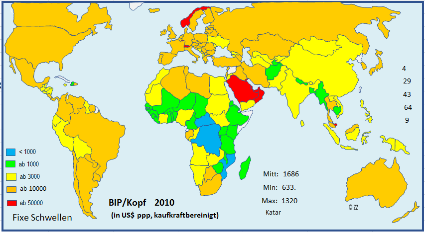
But of course you can not only compare within one timeline but with other variables as well. Let’s take GDP for instance, because you need a certain income to afford a cell phone.
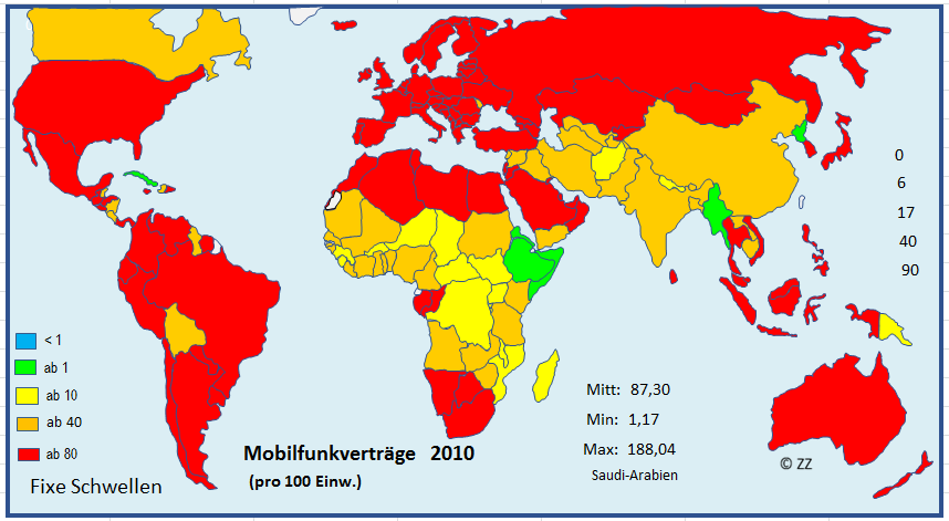
Let’s take the year 2010 when things started to ”explode”.
Here the map for the GDP
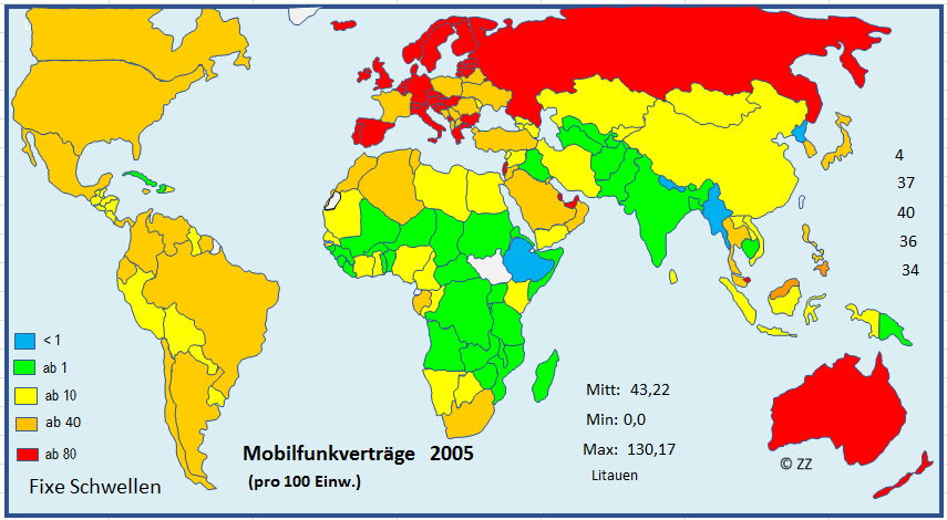
And here the map for the mobile cellular conscriptions:

And here is the overlay for the year 2010:
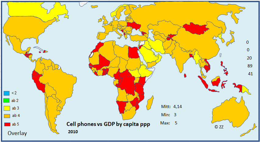
Yellow means adequate supply of cell phone compared to GDP (ppp). Orange means an increase in cell phone contracts compared to GDP and red countries have an enormous increase in cell phones contracts compared to their GDP, you might say, they are “overperforming“,.
This approach, of course, needs some more scrutiny (cell phone contracts don’t equal cell phones, and so on). I just want to show, what you can do with digital overlay
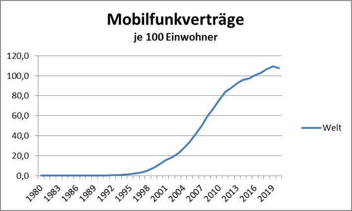
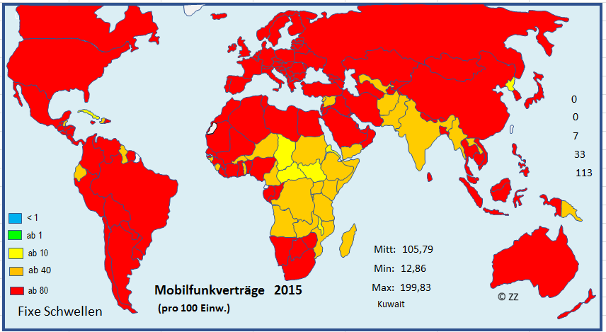
The last diagram shows the development of cellular conscriptions between the years 2000 and 2020 in the world regions:
