How fast does it grow?
The Demographic Transition
What is the demographic transition? It is about the development of the world population during the transition from the historic agrarian society to the modern society which is shaped by industry and services. That’s a very explosive question concerning the fate of mankind.
Because, if the growth of the world population cannot be stopped, it can lead to hunger, undernourishment and conflicts over the remaining more and more scarce resources. And even if nothing of that kind will happen, we still have to restore a sustainable ecological balance, so nature will have enough space to recover from human interventions.
The demographic transition is grounded on two strands of development. The first one: death rates decline because of medical advances, better hygiene, access to clean water and so on. This is, of course, a good thing but it leads to a dramatic increase of population.
But because in modern society an increasing number of children are no longer needed as workforce and for securing old-age insurance of the parents as it is normal in agrarian societies the number of births is slowly decreasing. Come in addition the changing life style due to growing prosperity. The consequence: the growth of population shrinks until the numbers begin shrinking.
Most states on earth are already far advanced in this regard, but the world population keeps on growing. Why? Nobody can explain this better than the sadly already passed away Swedish researcher Hans Rosling. See his TED-Talks on youtube: (https://www.youtube.com/watch?v=fTznEIZRkLg, or https://www.youtube.com/watch?v=hVimVzgtD6w)
Here his explanation in short: Even if the growth rates are declining practically everywhere, we still get a growth in absolute numbers, because the plateau, from which the growth now starts has become so large, that birth rates are still higher than death rates and therefore lead to more people as there were last year.
To illustrate this: Between 1960 and 1970 an annual growth rate of 2.6% lead to an increase of the population of about 72 million per year. Between 2000 and 2010 the annual growth rate was only 1.3% and lead to an annual increase of almost 81 million persons.
I do not intend to write another discourse about the demographic transition on a global scale. Please just look up Wikipedia. My contribution is trying to make the changes visible geographically, in its spatial dimension.
This seems important to me because the regions of the world are in a different phase of the demographic transition and within these regions exist large differences. But on this website I do not have enough space to display all the maps on country level which I created. Therefore I concentrate on the big world regions defined by United Nations.(see Menu Atlas/Regions on this site). If there should be enough persons interested in these maps I will create some pdf-files and post them on the Internet.
Now let’s have a look at the two components of demographic transition starting with the annual number of deaths.
The decline of mortality
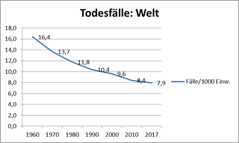
Globally the number of annual deaths per 1000 inhabitants from 1960 to 2017 has been cut in half. It’s a continuous development which is gradually slowing down.
The following two maps show the different development in the world regions.

The highest death rates we find in Sub Sahara Africa and South Asia, comparatively high rates in the Arabic countries and in East Asia, slightly below average in Latin America and In the underindustrialized countries of South West Asia and South Europe (from now on called Eur-As. This region contains Turkey and a number of States of the former Soviet Union) and the lowest quotas in the industrialized countries.

Map two offers a stunning picture. Until 2017 not all countries but all regions (that is: on average) show rates below 10 cases per 1000 inhabitants. Thus they have reached a similar level (in order of magnitude) as that of the industrialized countries. This would have been unthinkable without the amazing improvement of medical supplies on the whole planet.
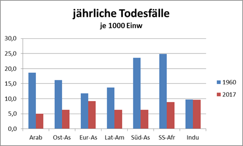
Diagram 2 shows that the highest decrease of death rates took place in the Arabic countries and in South Asia. And surprising: The industrialized countries by now don’t have the lowest but the highest rates.
Of course this is not due to bad medical supplies but on the contrary. As a consequence of outstanding medical supplies people live longer. The changing age structure in the industrialized countries is the reason that the death rates did not decline any further but remained on the same level.
The same also applies the other way around: the age structure may also have played an important role in the southern hemisphere. The fact that we find very young populations there certainly contributes significantly to the decline in death rates, above all, after succeeding in reducing infant and child mortality.
Now let’s have a look at the second component of the demographic transition, at the numbers of births per woman.
Declining Fertility rates
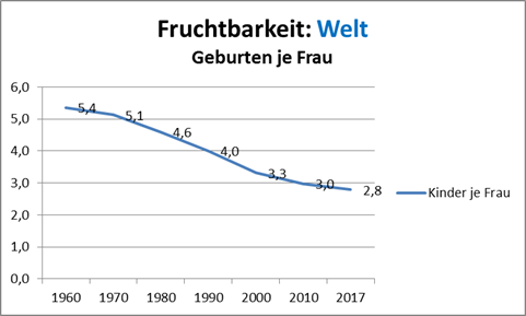
As mentioned before, the change in lifestye has lead to decreasing fertility rates.
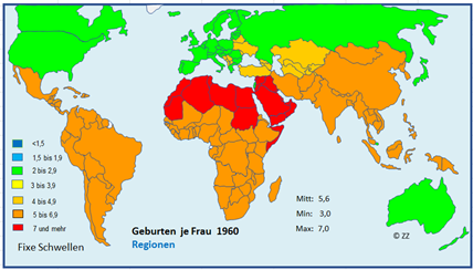
1960 we find in all developing countries very high fertility rates, especially in the Arabic countries. 2017 the situation has changed completely.
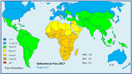
Until 2017 the numbers of births per woman have diminished in all developing regions. Latin America, South and East Asia have approached the level of the industrialized countries. The Arabic countries are close to the world average, and in Africa, too, fertility has declined, but has remained comparatively high.
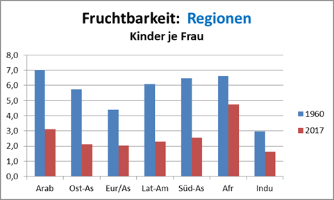
As you can see on diagram 4, the order of ranks has altered: In the Arabic region fertility has been cut down to half, the decrease in Africa is remarkable, but still less than half of the decline in the Arabic countries.
The Growth of World Population
Fertility declines but the population keeps on growing.
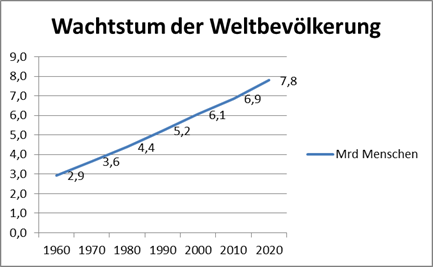
What is not so easily visible in this diagram is the gradual slowing down of the speed of growth. The annual growth rates are diminishing, from 1960 to 1970 about 2.5 percent to 1.3 percent between 2000 and 2010.
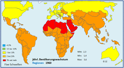

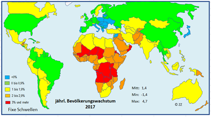
Looking at the geographical distribution patterns of the growth you will notice, that map 5 is identical with map 3 and map 6 identical with map 4. This is easy to explain: The speed of the growth is depending on the fertility rates alone, whereas the differences in death rates have lost their importance.

Diagram 6 shows by which percentage the population of the regions has grown since 1960 (index: 1960 = 100%). The number of inhabitants in the Arabic countries and Africa (Sub Sahara) have roughly speaking quadrupled, the number of inhabitants of Latin America and South India have tripled and the population of East Asia has slightly more than doubled in this period.
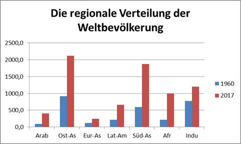
Diagram 7 compares the regional distribution of the world population between 1960 and 2017. It should remind you of the fact that Arabic Countries and Africa had a tremendous growth but started from relatively low levels.
Map 7 on country level displays the differences within the regions. I leave it up to your own observation, and just want to mention one example: notice the differences between the countries in North Africa and the ones on the Arabian Peninsula.
There remain a lot of questions, two are of especially important: When will we reach the peak of the growth? And how many humans will then live on this planet?
Some pessimists believe we will meet the peak not until the next century and that we will then have no less than 16 Billion people. The UN, and Hans Rosling by the way, expects 11 Billion by the year 2100.
Hopeless optimists, like me, (but also others, real experts among them) still think it’s possible to reach the peak earlier at a number of even slightly less than 10 Billion. This hope is based on the assumption of a further and faster decrease of fertility. (https://www.youtube.com/watch?v=nzBAxcJDSsc)
This is maybe not probable but it is not impossible. What is encouraging is the progress in fighting illiteracy and in spreading education and enlightenment. This goes along with the UN-program for the „Empowerment of women“, the fight against the disparagement and oppression of the female part of humanity.
Even if the earth could feed twelve billions and maybe more – such a large number of people living on earth is not desirable. For many reasons it is absolutely necessary, to secure a sustainable ecological balance, in other words: to give nature more space, the space that it needs to thrive.